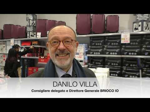
Paolo Roghi, merchandising manager of Brico io (see title photograph), who accompanies us during our visit to the retail outlet in via Benadir, at the corner of via Palmanova in Milan; with the incipit “The ideal store with a balanced combination of technical and decorative areas”.
It is incorporated in the shopping centre where the hyperstore is already present, the entrance to the store is from the lower floor, and where it is possible to immediately see the first novelty of the Lombardy Coop retailer: the electrical household goods area, with fridges, washing-machines, and dryers, not to mention brown goods, mainly televisions, to be found on the upper floor.
This product addition however is not totally new in this Italian DIY store (a similar addition having been made not long ago in the MondoBrico of Pavia), but which contributes, amongst other things to constitute a further step towards a shopping experience that is internationally defined as “home center”, in this case, in a local urban format.
DIY purists are rather skeptical, in seeing the extensive area dedicated to furnishings, the former area called Bella Casa which has here been re-named Kestile, rather than the central area of the store dedicated to textiles (second in terms of time, only to the recent installation in Concorezzo), however it must be pointed out that it has in no way diminished the classical merchandising canons of DIY, if not in relation to those products that are rather pointless in such an urban context.
What truly makes the difference here, is the general “layout” in the sense of presentation and display techniques. The result is a powerful visual impact, that has transformed the total area of 300-350 sq.m area dedicated to household goods/ furnishings into the true protagonists of the store.
In fact the direction is different right from the start, and as we already said, that from the lower floor at the end of the escalator, we find the Pet and Kestile departments, which welcome the visitor, providing an indication that the technical area is on the left and the decorative one on the right.
An authentic, constantly evolving test area. Because, while is true that the Outlet del Kasalingo (household outlet) has become a firmly established feature, what is new here is the emphasis given to its presentation; in the same way as the Kestile department, which has now been implemented in no less than 15 stores “it looks set to continue although there is still a need for further time to consolidate the feature” as highlighted by Roghi.
As far as the textile and electrical appliance departments are concerned the outcome remains to be seen, however we cannot but point out that obvious experimental feel of the brand, and leaving sales figures aside, the commitment to the creation of an original identity that distinguishes it from its competitors.


Facci sapere cosa ne pensi